


We all are familiar with the modal that pops out of nowhere while clicking a button or link. Modals are a commonly seen UI part of websites. Building modal components fairly makes it easier to extract some submission form or alert messages to the user. In this article, we will discuss how to build modal components in a reusable manner.
So when we approach how to build a modal there are some key points that come into mind.
- Opening modal on button click
- Closing modal on button click
- Closing modal on click way
So we have a button with class modal_button clicking on which opens the modal. And modal_button class buttons must have the attribute data-modal which has a value id of the modal. Each modal should have the class name modal and adding active class name makes the modal visible to the user.
Lets have a look at the HTML template for modal.
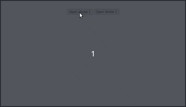
<!-- clicking on button opens modal-1 -->
<button data-modal="modal-1" class="modal_button">Open Modal 1</button>

<!-- modal-1 -->
<div id="modal-1" class="modal">
  <div class="modal_content">
    <header class="modal_header">
      Modal 1 Header
      <button class="modal_close">x</button>
    </header>
    <div class="modal_body">
      Lorem, ipsum dolor sit amet consectetur adipisicing elit. Illo corporis
      veritatis dolor architecto sequi quaerat. Earum illo obcaecati in ea
      dolorum aperiam aut rem amet, harum pariatur, assumenda recusandae optio.
    </div>
    <footer class="modal_footer">
      Modal 1 Footer
      <button class="modal_close">Close</button>
    </footer>
  </div>
</div>
You can also have a look at the CSS styles for modal. With just modal class name modal element has display set to none making it invisible and when we add active class name we set its display property to flex making it appear on to the screen.
.modal {
  position: fixed;
  top: 0;
  left: 0;
  width: 100vw;
  height: 100vh;
  background-color: rgba(0, 0, 0, 0.6);
  display: none;
  z-index: 100;
}

.modal.active {
  display: flex;
  justify-content: center;
  align-items: center;
}

.modal_content {
  position: relative;
  max-width: 500px;
  width: 100%;
  max-height: calc(100vh - 5rem);
  display: flex;
  flex-direction: column;
  justify-content: space-between;
  background-color: white;
}
Opening modal on button click
Whether the modal is open or not is determined by the presence of the class name active. If active class name is present, the modal is visible else the modal is invisible. Since we will be toggling modal between open and close state quite often, we can make a helper function toggleModal to fulfill the purpose.
function toggleModal(modalElm) {
  modalElm.classList.toggle('active');
}
By clicking on modal_button we can access its attribute data-model inside event listener and using which we can toggle the class name active of the modal we want.
const modalTriggerBtns = document.querySelectorAll('.modal_button');

modalTriggerBtns.forEach((btn) => {
  btn.addEventListener('click', triggerModal)
});

function triggerModal(e){
  const modalId = e.target.getAttribute('data-modal');
  const selectedModal = document.getElementById(modalId);
  toggleModal(selectedModal);
}
Closing modal on button click
There can have multiple closing buttons (with modal_close class name), probably at the header and footer, and sometimes closing modal should be triggered after form submission. When we click on a closing button we should find the current active modal. Assuming that at a time one modal is open, we can query for a DOM element with .modal.active class and close the modal.
const modalCloseBtns = document.querySelectorAll('.modal_close');

modalCloseBtns.forEach((btn) => {
  btn.addEventListener('click', closeModal);
})

function closeModal() {
  const currActiveModal = document.querySelector('.modal.active');
  toggleModal(currActiveModal);
}
Closing modal on click away
We can add eventListener on document to check whether each click event contains the current active modal
document.addEventListener('click', modalClickAway);

function modalClickAway(e) {
  const currActiveModal = document.querySelector('.modal.active');
  if(!currActiveModal) return;
  if(e.target.contains(currActiveModal)) toggleModal(currActiveModal);
}
If you would like to reuse this modal library you can import the styles and scripts into your project. You can also customize CSS classes by linking an extra custom.css file with the desired styles you want.
<head>
  <link
      rel="stylesheet"
      href="https://reusable-modal.aseerkt.repl.co/modal.css"
    />
  <link rel="stylesheet" href="custom.css" />
</head>

<body>
  ...
  <script src="https://reusable-modal.aseerkt.repl.co/modal.js"></script>
</body>
You can also check out the sample code palette in repl - reusable_model. Hope you have found what you are looking for. Stay tuned for new content.